So, although I don't have much in the way of progress shots for making the final version of Vogue 2903 (AKA my wedding dress!), I did do some cool stuff with it that I want to share.
Originally, my idea had been to make a green dress with white lace, but I couldn't find a fabric combination I liked. I started plotting other possibilities and did some test doodles of ombré dying or painting a design.
 |
| The orange and purple at the bottom was to test petticoat colors. |
Ultimately, painting the design looked best in the doodles, and it was more controllable and familiar. I haven't done much with complex fabric dyeing, but I've painted plenty of stuff on fabric before, most notably the dragon on my Yue Ying costume.
 |
| Between drawing the stencil and painting it, it took about 8-10 hours in a 1-day stint right before the con. I sat so long, I bruised my hip! |
These past projects had all used basic acrylic paint with textile medium, and while I'd never had a problem with it drying or holding up to wearing without proper heat setting, etc., I wanted to make sure I did it right on the wedding dress.
I spent several days digging through cosplay forums and craft blogs looking for information on textile paints, and Jacquard had the most votes. I researched a little more and bought three greens: Apple, Emerald, and Metallic Olive.
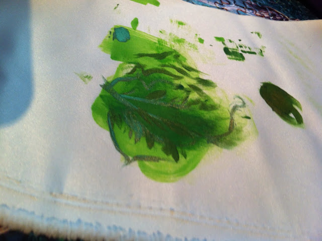
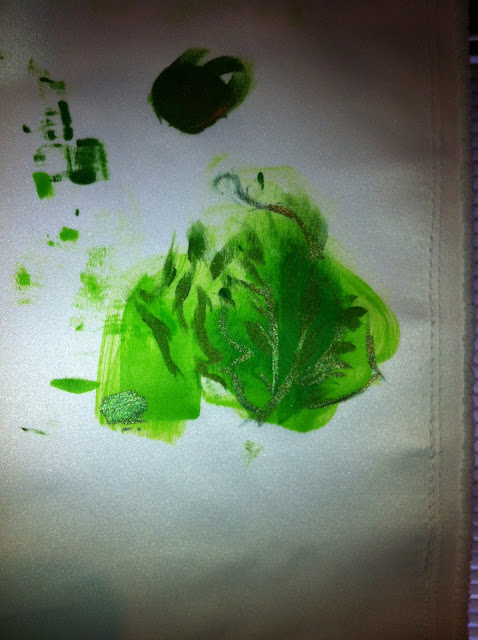
| The metallic olive was Lumiere (seen above) and the others were Textile Colors. |
Before I bought the actual fabric for my dress, I bought 1/8 yard of the two types I was considering for test strips. I didn't want to by 6+ yards only to find out that the paint bled unexpectedly or the like.
I tested the paints individually, blended them, and tried them with a little water added, which you can do with Jacquard for a watercolor effect. They're amazingly versatile, and almost every type and color of their paints can be blended together. It worked perfectly on both of the satins I tried, with only a little bleeding on the watered down parts. Update! I found some of my swatches!
 |
| This was the original test swatch with apple and emerald on cheap white satin. |
These are different shots of the final test swatch. As you can see, the metallic olive has a gold/bronze undertone. It's gorgeous, but it was a pretty stark difference from apple and emerald. I did blend it with the emerald somewhat, but ultimately, the metallic undertone didn't fit the look I wanted. Plus, trying to keep a consistent blend for this big a project without potentially wasting a lot of paint was a bit more work than I was ready for that late in the evening.
So, while I didn't use the metallic olive here, expect to see some painted bellydance gear with this stuff sometime in the future!
Once you paint, you're supposed to let the work air dry 72 hours or heat set it after 24 hours. These paints dried amazingly fast for humid south Louisiana, and I even accidentally washed a swatch after only 24 hours without heat setting--and the paint stayed perfectly! It was amazing.
As for the design, I don't do well making up my own, so I tried to look up leaf and vine designs. Eventually I came across a collection of Celtic woading designs at Mehandi.com. I was a little worried about issues of appropriation, but the author of the history Finding Blue at Mehandi makes a strong argument that these designs are a separate, modern creation only loosely based on scattered clues about an ancient tradition. Add that to my chunk of Irish and Scotch-Irish heritage, and I decided that simple vine-like designs or Celtic knots would be okay.
I had a couple of possible designs, and decided that I would make stencils of the individual pieces. With stencils, I could lay out the design on the finished skirt however I wanted. Sizing the stencils was a little tricky since I had to approximate the size of the space I'd be working with on the finished skirt, but it worked out well. In the end, I only used four pieces out of the six I'd drawn and the eight I'd originally planned!
 |
| The one right above my thumb became the template, but the final design ended up looking half like the one above it. And no, I have no idea what that weird orange doodle was supposed to be. |
There were, like everything else, a million ways to the stencils, but for the sake of ease, I decided to go with contact paper. It would stick to the fabric (and didn't leave a residue, again tested on the swatches) so that I didn't have to worry about bleeding under the edges of the stencil. Also, I was able to cut out the designs with a relatively dull exact-o knife--not something you can say about plastics or even cardstock. Ultimately, I just free-handed the designs, cut them out, and rolled them up to await painting day.
 |
| I can't figure out the exact name or brand anymore, but this is what the contact paper looks like. I bought a cheap, multi-colored pack of four at Office Depot. |
 |
| This was a pattern I didn't cut out--too complicated. But note the orange triforce my sister added to the center triangle. |
After working for a few weeks to finish my final version of the wedding dress at my (now) in-laws' home, I was ready to paint. It was absolutely nerve-wracking. I was terrified I'd mess it up, but it wasn't going to happen at all if I let myself be scared. So, around 8 or 10 pm (I honestly can't remember), I laid out the contact paper stencils. My sister helped me figure out the best placement, and once we had it set, I took off the backing and stuck the stencils down.
I chose not to use the metallic green--it didn't blend quite as well as I wanted it to--and just started with the lighter apple green, filling in all the stencil areas. While the paint was still wet, I started added emerald green to add some shading and depth. It was kind of an accident, but it worked out well. By the time I was done with that, it only took a few minutes before BOTH layers/blendings of apple and emerald had dried enough for me to remove the stencil. All of the sudden, I could see the design unobstructed, and it looked AWESOME.
Still, it wasn't done yet. If you look at woading designs, they have a light, watercolor blue look detailed by a more concentrated form of the same blue.
If I wanted that look, I had to go back in and add that kind of detail.
This was the second nerve-wracking moment. I was terrified of messing up or the detailing not looking good, especially since I have slightly shaky hands and the stencils were off. I couldn't leave the stencils on, either: they would have messed with the natural lines and occasional detailing off of the wash that I wanted to replicate.
The paint was dry enough to paint over with another layer of emerald green with no bleeding at this point, so that should tell you how fast this stuff dries, at least on bridal satin. Anyway, with just a few pictures from Ancient Blue for reference, I went in and added in the details with my finest brush. I actually did have a few mistakes, but like with so many things, they either weren't really noticeable or I was able to cover them up.
So, how did it turn out? Take a look!
 |
| See that little vine under the heart? I totally painted an accidental smudge there and made the vine to cover it up! The purple stuff is extra contact paper helping protect the table from paint. |
 |
| The contact paper was even forgiving with the seams. I honestly put down that first layer carelessly fast in a weird moment of stress-induced insanity. But it worked! |
Luckily, I was able to take some wonderful bridal photos at the last minute with my amazing photographer, Madison Baltodano. Sadly, she's just moved to Costa Rica and will soon be moving to New York. If you live in either of those areas and need wedding/bridal/family/newborn pictures, look her up!!!
 |
| TWIRLS!!! |
 |
| This is how the skirt looks without pleats, by the way. I bought a cheap petticoat to help shape the skirt and add a fun pop of color. |


No comments:
Post a Comment